Functional Elegance
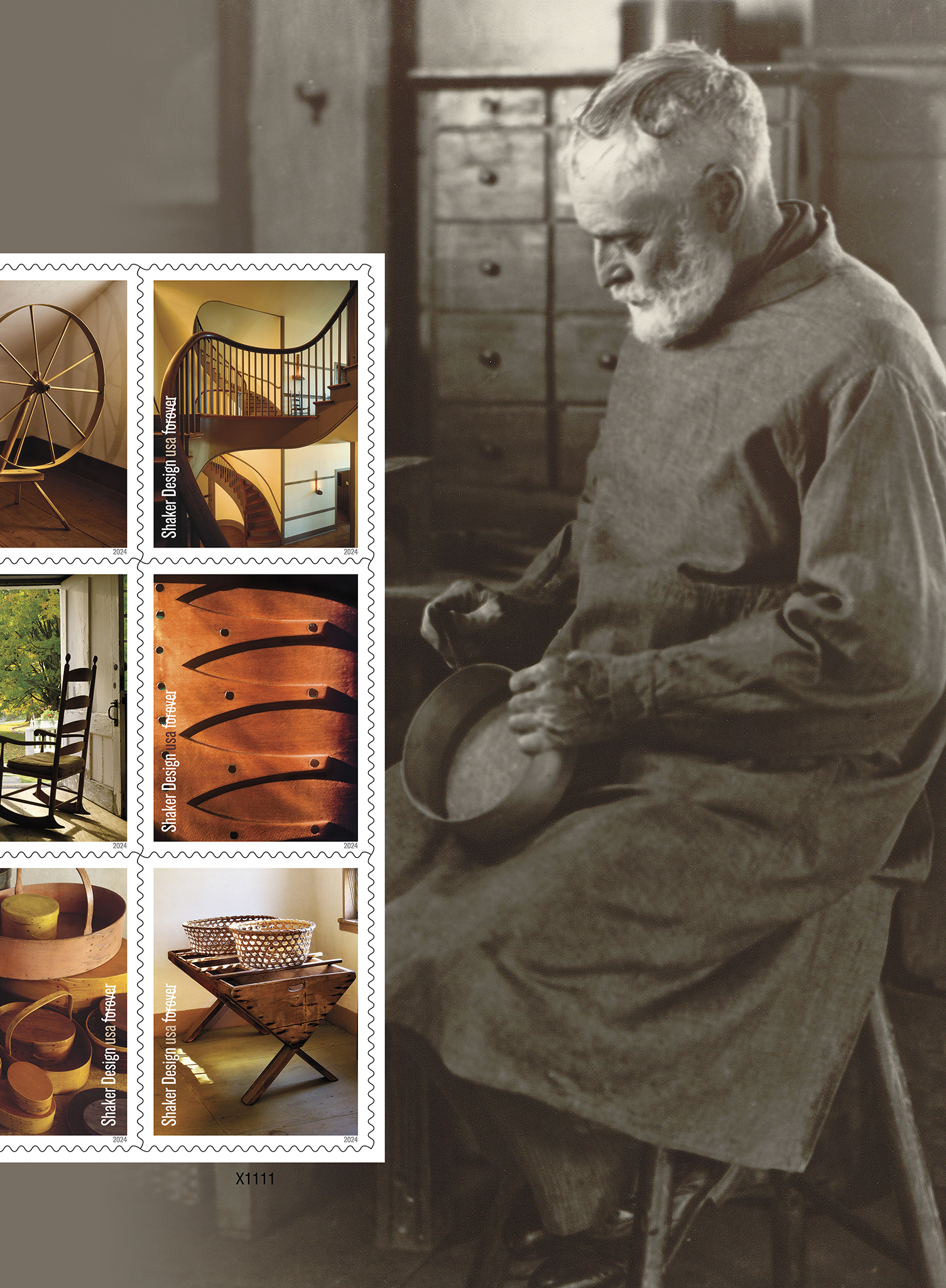
There is something almost indescribably pleasing about a classic Shaker box. Glossy wood bends to form a perfect oval. Graceful “swallowtail” joints comb the side, narrowing into delicate tips.
A centuries-old religious sect devoted to the art of simple living, the Shakers have become known for such impeccably designed details. And when postal art director Derry Noyes was first tasked with creating the Shaker Design stamps, she wanted those design minutiae to dominate the stamp artwork.
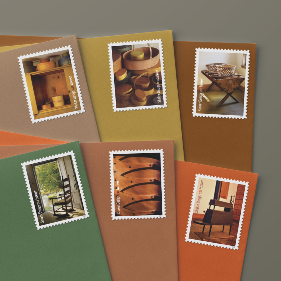
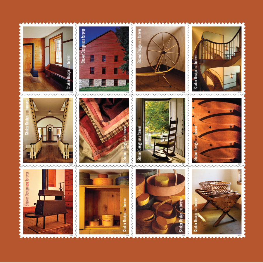
Drawn to the work of longtime Smithsonian magazine photographer Michael Freeman, Noyes sifted through his collection of Shaker community images and selected photographs capturing things like the faint gleam of tiny copper tacks, corners of vibrant silk handkerchiefs, and sunlight through hexagonal holes in loosely woven baskets.
The stamps were beautiful, but looking back, Noyes says something was missing. “They were maybe too design-y, which appeals to me, but that’s because it’s my profession,” she says. “They were just a little too sterile.”
After reviewing the other possible stamp subjects slated for that year, the U.S. Postal Service’s art team decided to put Shaker Design on hold.
It would be four years before Noyes would return to the stamps — and bring a new perspective.
“A reason for everything”
Practicing a religion that originally stemmed from Quakerism, the Shakers harbored pacifist convictions, a love for simplicity, and a strong commitment to celibacy. Although they first arrived in America in 1774, only one active Shaker settlement remains.
Still, the stunning minimalism of their design lives on. People today primarily experience Shaker craftsmanship in museums and in former villages, which are maintained as historical sites. But it’s important to remember that it wasn’t always this way, Noyes says.
Unlike works of fine art, pieces of Shaker design “are everyday objects,” she explains. “They are utilitarian. Now they are in museums, but these are the things people actually used in their kitchens.”
Michael Freeman also considered this as he shot the photographs that would one day appear on the stamps. For more than a year, he painstakingly captured the trappings of Shaker life in every weather and lighting imaginable, traveling to preserved villages in New Hampshire, Massachusetts, New York, and Kentucky.
For Freeman, the purpose behind Shaker design gives it that minimalist beauty. When it comes to the Shaker aesthetic, “there’s a logic to the simplicity,” he says. “There’s a reason for everything, and that concentration on functionality brings its own elegance.”
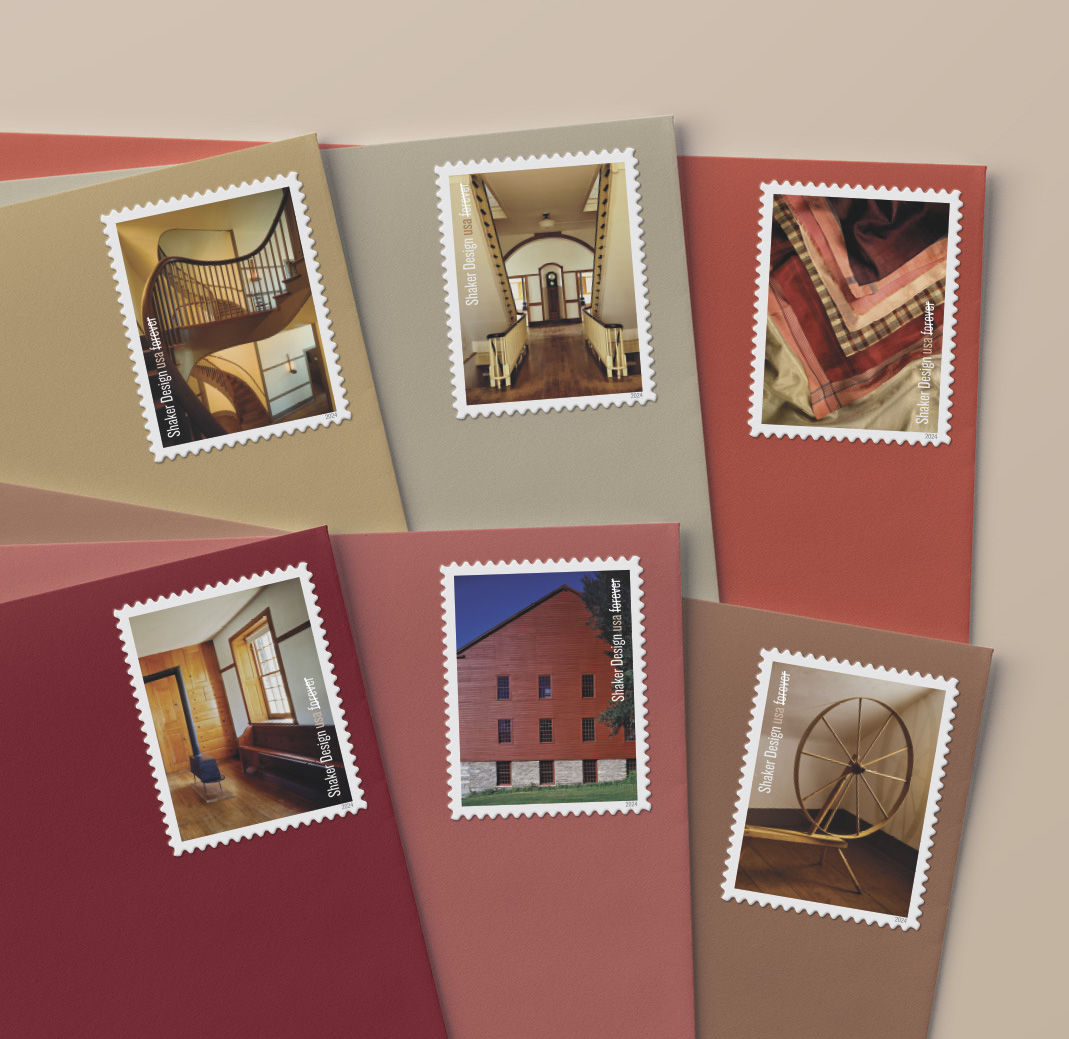
Everywhere you look, form and function weave together in Shaker design. Legs on chairs taper artfully, and not just because this looks attractive: It also makes them lightweight and strong. Open floors and abundant cupboards don’t just help Shaker buildings feel airy and spacious — once upon a time, they also protected belongings from dust and allowed for easy cleaning of each room.
You get the interior of the room and the quality of the craftsmanship, and you can imagine somebody going up and down that staircase.
Even the swallowtail joints on Shaker boxes serve a purpose: to prevent the bent wood from cracking.
These thoughtful design touches evolved from Shaker beliefs in order, durability, and joyful simplicity. As Freeman traveled to the different villages, he noticed the long rails that lined building interiors, where people once hung everything from clothes to chairs. This design feature, he believes, perfectly articulates the Shakers’ love for cleanliness and organization.
“[The attitude was] everything in its place in the building, everything in its place in your soul,” he says.
Freeman shot his photographs in the late 1990s, long before Noyes would begin work on the stamps. But both of them understood that for the Shakers, beauty and utility were inextricable. Shaker creations might classify as works of art, yet they remain quite different from sculptures or paintings. They were designed to be used.
A new direction
When Noyes returned to the Shaker Design stamps in 2022, she took a different tack.
“I wanted to show how people might have lived in these buildings, not just details of the specific things that they made,” she explains. Noyes and the rest of the stamp art team turned to Freeman’s photographs that featured larger rooms and building exteriors, not just tiny examples of design ingenuity. By zooming out, they aimed to help stamp viewers imagine how Shakers engaged with the design in their daily lives.
On one stamp, a rocking chair stands by an open door, as if a person had been sitting there just moments before, watching the wind in the trees. On another, two staircases seem to weave and twirl around each other, evoking bustling activity even as they stand empty.
Shaker creations might classify as works of art, yet they remain quite different from sculptures or paintings. They were designed to be used.
“You get the interior of the room and the quality of the craftsmanship, and you can imagine somebody going up and down that staircase,” Noyes says. “That says it all right there.”
To further emphasize the human beings who designed and used Shaker creations, the stamp sheet now features a different kind of image on the selvage: a black-and-white photograph of a Shaker man assembling an iconic bentwood box.
Noyes thinks the portrait will resonate with viewers, even as it reminds them of how differently the Shakers approached their work.
“It gives the stamps a bit more of a human quality that we can identify with,” Noyes says. “I think that's such a tender image of him working — without earphones, no distraction.”
Handmade beauty
In the final pane of 12 stamps, some of the close-up shots that Noyes originally selected remain — not only to create a sense of variety, but also to highlight the care that the Shakers poured into everything they made. All work was a form of worship in their eyes, leading them to approach design in a way that feels uniquely devotional and assiduous.
Growing up in New England, where she was frequently surrounded by Shaker furniture and architecture, Noyes has been drawn to that loving attentiveness for years. Her father, an architect, and her mother, an interior designer, taught her to appreciate the beauty of thoughtful design. Although as a child, she sometimes found it hard to embrace her parents’ perspective.
“It was always so embarrassing to me at restaurants, how my mother would poke her head underneath the corner of a chair to see the detailing and say, ‘Oh, I love this, you can see how it was made!’” she says, laughing.
But today, Noyes thinks of the stamps that feature design minutiae as a testament to her mother. Selecting those images was her own way of exclaiming, “See how beautiful this is, this little detail that most people would not even begin to notice!” she says.
The U.S. Postal Service has been celebrating those types of details for decades, featuring remarkable works of craftsmanship on many different stamps, from Amish quilts and Navajo blankets to Alexander Calder’s colorful mobiles and Ruth Asawa’s intricate wire sculptures. This kind of design stands in sharp contrast to the mass-produced furniture, clothing, and household decorations that are so commonplace today, Noyes points out.
Now more than ever, seeing objects that a real person wove, carved, or lathed with their own hands — whether that person belonged to a Shaker community or your own — can feel very intimate.
In fact, “it’s not unlike getting a letter in the mail that someone’s handwritten,” Noyes says. “You think, ‘Oh, someone’s taken the time to write me a letter!’ That didn’t used to be so precious.”